Reorganizing a Mobile Platform Built for Complex Purchasing Decisions
Lead Product Designer
Dan’s Recycling and Autocore
Savage Innovations
B2B Mobile Purchasing Platform (iOS & Android)
Automotive Recycling • B2B SaaS
Project Manager
Lead Software Engineer
Software Engineers
Business Stakeholders
2023-2024
Product Discovery • Product Audit • Workflow Analysis • Information Architecture • Interaction Design • Design Systems • Design QA • Implementation Support
Platform at Scale
Professional catalytic converter buyers make purchasing decisions in fast-moving environments. They need quick access to pricing, reference images, inventory information, and compliance documentation while evaluating materials and completing transactions in the field.
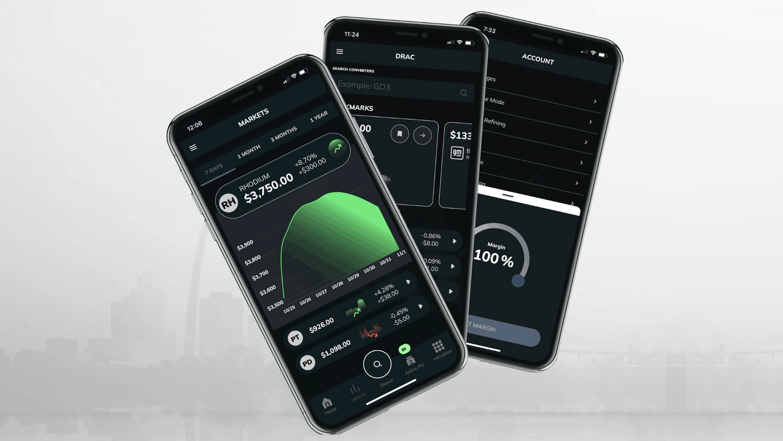
DRAC is a subscription-based mobile platform supporting converter identification, pricing, purchasing, compliance, and inventory management throughout the buying process.
By the time this project began, the product had grown significantly as new capabilities were introduced to support evolving business needs. While each addition addressed a specific requirement, the overall organization of the platform had not evolved alongside it, creating unnecessary complexity for users navigating everyday purchasing workflows.
My role was to understand how the product had evolved, identify where complexity had accumulated, and reorganize the experience around the workflows professional buyers already relied on while preserving familiar patterns.
Product Scale
21K+
Registered Users
19K+
Mobile Downloads
11K+
Converter Records
4.7K+
Images
1M lbs
PGM Material Processed
Platform metrics were provided by the client and development team and are included to illustrate product scale rather than individual design impact.
Table of Contents
Overview
Project Snapshot
Challenge
Reorganize a mobile purchasing platform that had become increasingly difficult to navigate as new features were added over time. The application supported converter identification, pricing, purchasing, compliance, customer management, and other operational workflows. As the product evolved, related tasks and information became separated, making common purchasing decisions more difficult to complete in the field.
Role
As Lead UX/UI Designer, I led the product design effort from discovery through implementation. I conducted the product audit, analyzed existing workflows, reorganized the information architecture, designed new interactions and interfaces, collaborated with engineers and stakeholders throughout development, and supported implementation through design QA.
Direction
The project began by understanding how the product had evolved and where complexity had accumulated over time. Through the audit, I identified that related information and tasks had become disconnected as new functionality was introduced. This became the foundation for reorganizing the application around the purchasing workflow, bringing connected information closer together and making navigation more predictable while preserving familiar patterns for experienced buyers.
Outcome
The redesigned product created a more organized purchasing experience by simplifying navigation, improving relationships between connected tasks, and integrating compliance into the purchasing workflow. Buyers could move through the application with less searching and fewer interruptions while continuing to use workflows they were already familiar with.
Business Context
A Product That Had Outgrown Its Original Structure
DRAC started as a way for catalytic converter buyers to quickly look up pricing in the field. Over time, the product grew alongside the business. What began as a pricing tool expanded to support purchase orders, compliance documentation, customer management, inventory, calculators, and a converter database containing thousands of records and reference images.
Buyers relied on the platform throughout the purchasing process, making it one of the primary tools they used every day.
As more functionality was introduced, the application became harder to navigate. Each new feature solved a specific business need, but the overall organization of the product had not evolved alongside it. Related tasks became separated, navigation reflected where features had been added rather than how buyers completed their work, and common workflows required moving between multiple areas of the application.
Experienced buyers had learned where everything lived because they used the product every day. Newer users did not have that same familiarity. The application contained the information buyers needed, but finding it often depended on knowing where to look rather than the product guiding them through the process.
Before making design recommendations, I needed to understand how the application had evolved, where complexity had accumulated, and how buyers moved through the purchasing workflow.
That work started with discovery.
Discovery
Understanding the Product Within Its Constraints
My first instinct was to observe buyers in the field. Purchasing catalytic converters happens quickly, often in environments that are difficult to recreate elsewhere, and I wanted to understand how buyers moved through the application while making purchasing decisions.
Several buyers were not comfortable having a designer accompany them during purchasing trips, so our project manager and senior engineer observed those workflows instead. They documented what they saw, shared their findings with the team, and helped answer questions throughout the project.
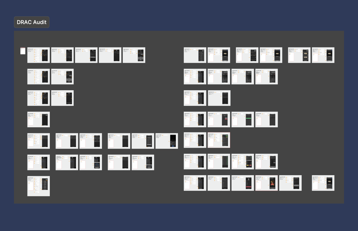
At the same time, I completed a full audit of the application. I documented every screen, mapped navigation, traced purchasing workflows, and worked closely with the lead developer to understand how different parts of the product had evolved over time.
As I worked through the audit, I kept coming back to the same questions.
Why is this feature here?
Why is this workflow separate?
Why do similar interactions behave differently?
Sometimes there was a clear business or technical reason. Other times, the answer was much simpler. The product had evolved over several years. New functionality had been added as the business changed, but earlier decisions had never been revisited because they continued to work well enough.
Finishing the audit answered many of my questions, but it also changed how I viewed the product. I was no longer documenting individual screens. I was documenting the relationships between features, workflows, and information, which made it easier to see where the experience had become fragmented over time.
Product Direction
Connecting the Pieces Into One Workflow
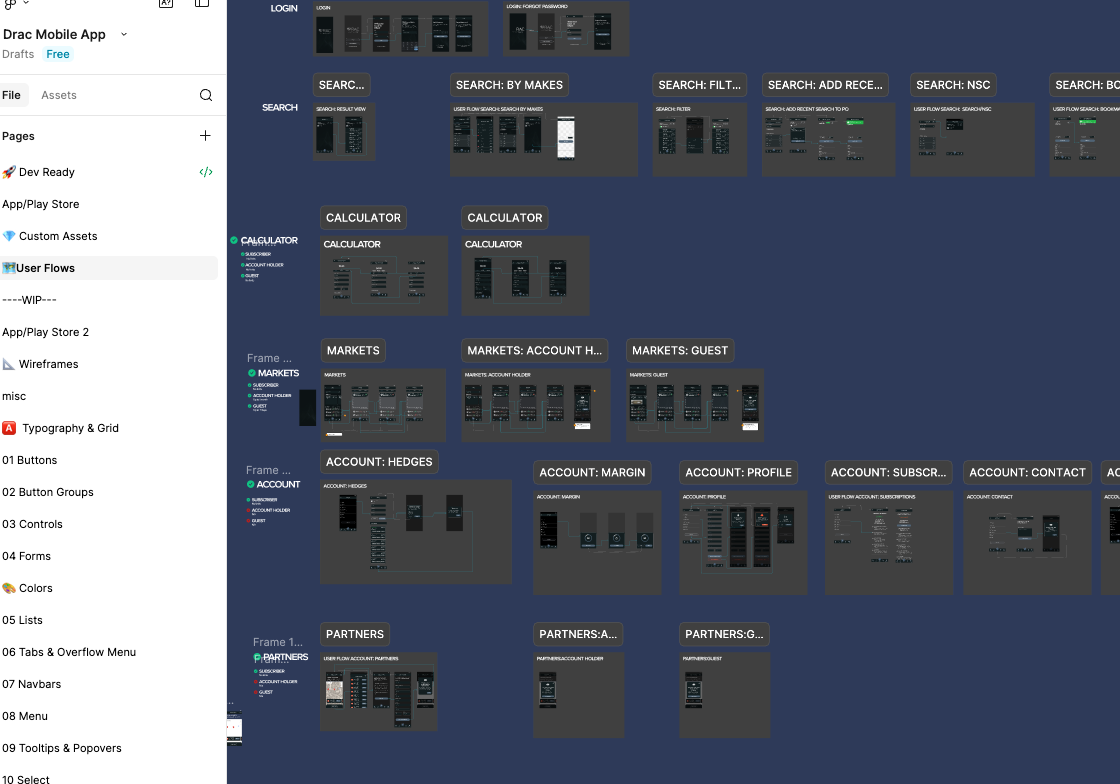
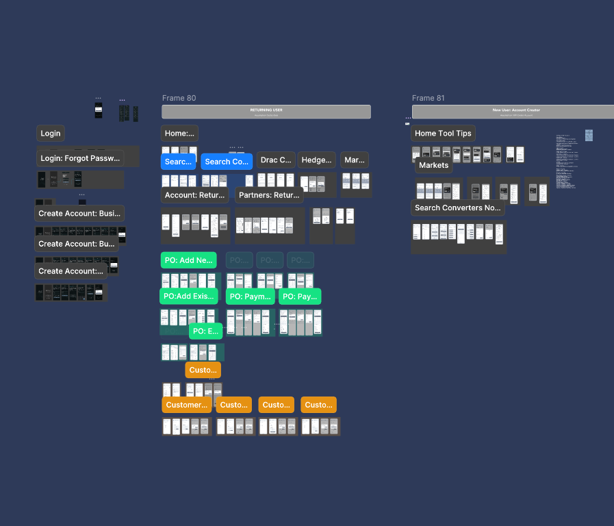
By the time I finished the audit and reorganized the information architecture, the direction of the project became much clearer.
I wasn’t looking for opportunities to introduce new features because the application already supported the work buyers needed to complete. The challenge was improving how information, navigation, and related tasks were organized throughout the product so buyers could move through the purchasing process with less effort.
One of the biggest shifts was moving away from thinking about the application as a collection of individual features and instead looking at it as one continuous purchasing process.
Buyers weren’t opening the app to use a pricing feature or a compliance feature. They were purchasing catalytic converters, and every tool inside the application supported some part of that process.
Once I started looking at the product through that lens, many of the design decisions became easier to evaluate. The goal was no longer to improve individual features in isolation. It was to create a structure that supported the way buyers already worked instead of reinforcing the way the application had been organized over time.
One example was compliance.
During the audit, compliance existed as its own area within the application. Initially, that made sense because different states had different documentation requirements. As I continued discussing the workflow with stakeholders, I learned that every purchase already followed a common set of federal requirements regardless of where the transaction took place.
Rather than asking buyers to leave the purchasing workflow to complete information they were already collecting, I recommended integrating those federal compliance requirements directly into the purchasing process. State-specific requirements could still be accommodated when necessary, but the majority of the workflow could happen as part of the purchase itself.
That decision reinforced the broader direction of the redesign. Instead of treating pricing, converter identification, purchasing, compliance, and customer information as separate destinations within the application, I focused on making them feel like connected parts of the same workflow.
Buyers still had access to the functionality they relied on every day, but the path between those tasks became more intentional because the product structure better reflected the work it supported.
Design Execution
Refining the Experience Without Disrupting Familiar Workflows
The new structure clarified where information belonged, but it did not answer how buyers would move through that information while identifying converters, reviewing pricing, documenting purchases, and completing compliance requirements. Those interactions needed to support the same workflow decisions made at the product level.
As I worked through each workflow, I kept returning to the same question I had been asking throughout the audit:
What does the buyer need next?
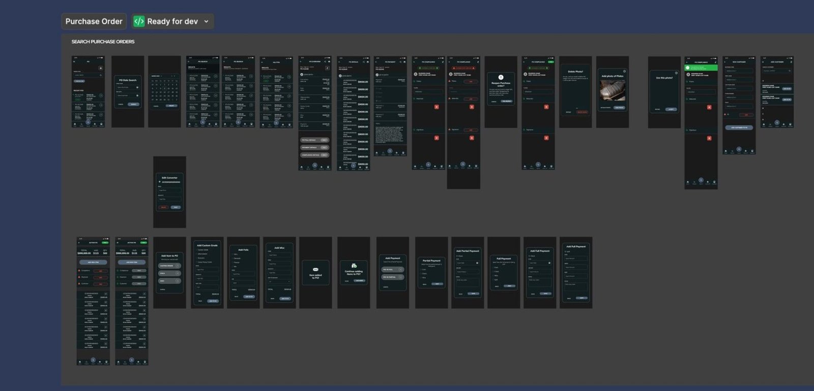
That question influenced many of the design decisions that followed. Instead of treating each screen as an individual destination, I designed them as connected steps within a larger purchasing process. Information buyers regularly referenced together was brought closer together, navigation between related tasks became more direct, and common actions were positioned based on how buyers were already using the product.
The audit also uncovered smaller inconsistencies that had accumulated as the application evolved. Similar interactions sometimes behaved differently depending on when a feature had been added, layouts varied between comparable screens, and navigation patterns were not always predictable.
Individually, these issues were minor. Together, they created additional friction because buyers had to adjust to different patterns throughout the application. As I redesigned each area, I looked for opportunities to create more consistency while preserving the behaviors experienced users had already learned.
One of the more important decisions during implementation was recognizing that consistency was not always the right answer.
Some parts of the application had remained largely unchanged because they already worked well, and buyers had developed familiarity with those workflows. Replacing those interactions simply to make every screen look or behave the same would have introduced unnecessary disruption without providing meaningful value.
Throughout the redesign, I weighed whether a change genuinely improved the purchasing experience or whether it only made the interface more uniform.
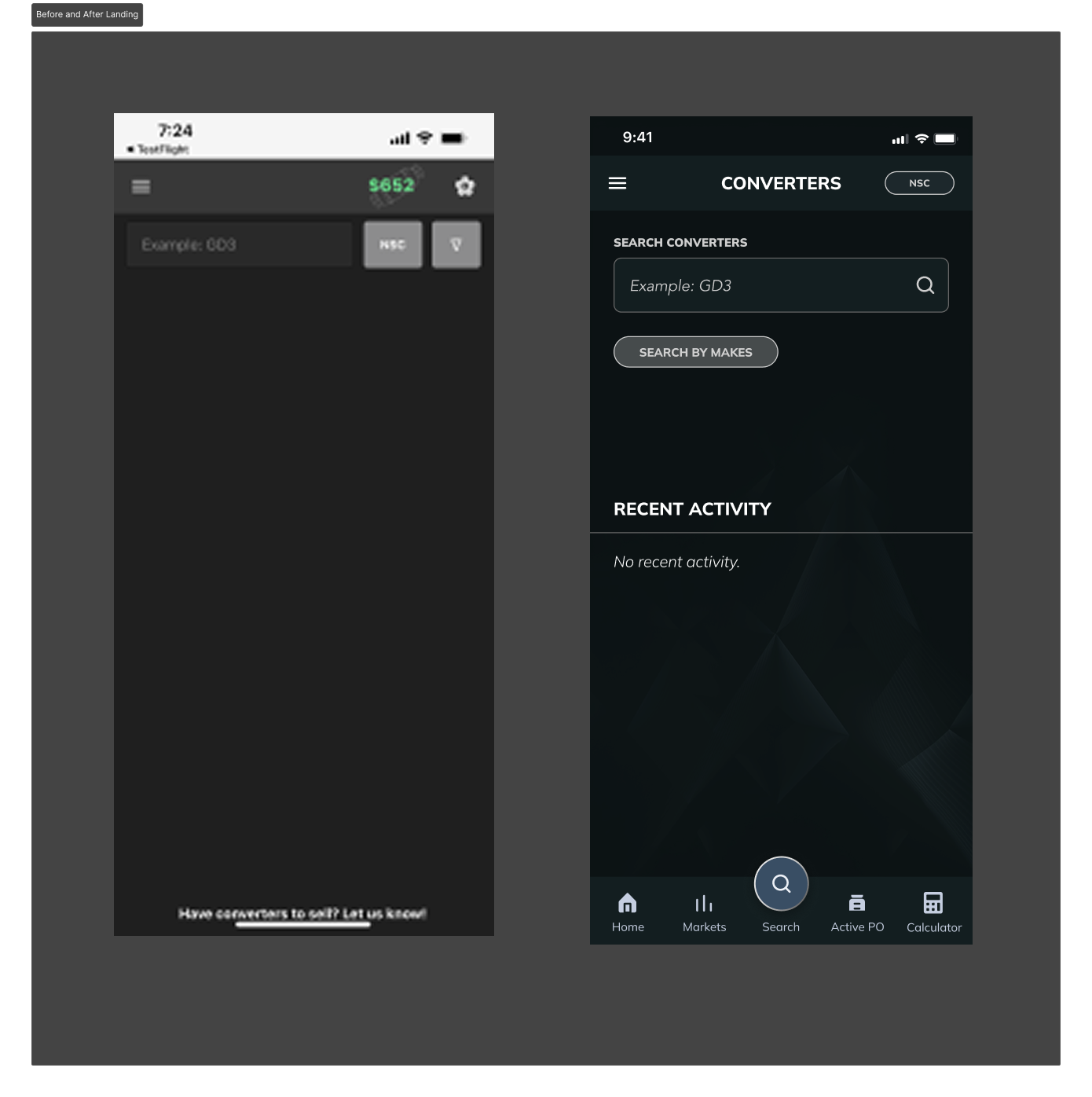
By the end of the redesign, the application supported the same work it always had, but moving through that work required less searching, fewer unnecessary transitions, and fewer moments of uncertainty about where information lived.
The individual interface changes were important, but they were all guided by the same objective: creating a more connected purchasing experience without disrupting the workflows buyers already depended on.
One of the more important decisions during implementation was recognizing that consistency wasn’t always the right answer. Some parts of the application had remained largely unchanged because they already worked well, and buyers had developed years of familiarity with those workflows. Replacing those interactions simply to make every screen look or behave the same would have created unnecessary disruption without providing much value. I found myself making that tradeoff repeatedly throughout the project, weighing whether a change genuinely improved the purchasing experience or simply made the interface feel more uniform.
By the end of the redesign, the application supported the same work it always had, but moving through that work required less searching, fewer unnecessary transitions, and less mental effort to understand where information lived. The individual interface changes were important, but they were all guided by the same objective: making the purchasing process feel more connected from beginning to end.
Tradeoffs
Deciding What Was Worth Changing
By the time the audit was complete, I had a clear understanding of where the product had become difficult to navigate. The challenge was deciding which changes would actually improve the experience and which changes would create unnecessary disruption for buyers who already relied on the application.
Throughout the product, I found workflows that had become more complicated as new functionality was added over time. Those areas were good opportunities for improvement because reorganizing the experience could help buyers complete the same tasks more efficiently.
At the same time, there were parts of the application that experienced buyers had used successfully for years. Those workflows were not always perfectly consistent with the rest of the product, but changing them simply to make everything match would have forced users to relearn processes that were already working.
That became an important consideration throughout the redesign. Every proposed change needed to solve a real problem.
If a workflow made information harder to find, required unnecessary navigation, or slowed buyers down, it was worth changing. If an interaction already supported the purchasing process effectively, I left it alone.
Consistency was valuable, but only when it helped buyers complete their work more effectively. Creating consistency without considering the impact on existing users could create more friction instead of reducing it.
Working through those decisions changed how I approached redesign projects. Looking at an existing product, it is easy to identify things that could be cleaner or more consistent. The harder part is understanding why something exists the way it does and whether changing it will actually make the experience better for the people who use it every day.
For DRAC, the goal was not to replace the product users already knew. It was to improve the experience while preserving the workflows that were already supporting their work.
Results
Strengthening a Product Buyers Already Relied On
The redesign focused on improving how buyers moved through the product rather than expanding what the product could do.
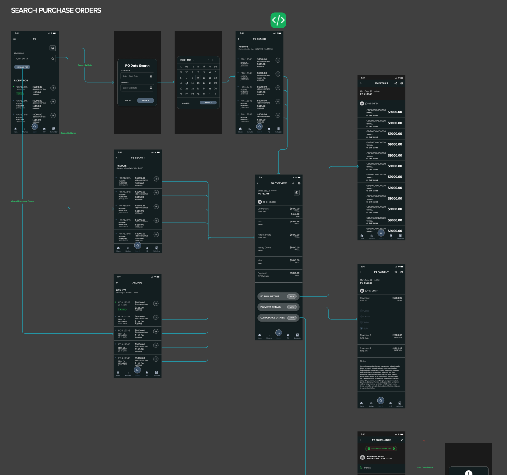
By reorganizing the application around the purchasing workflow, related information became easier to find, navigation became more predictable, and common tasks required fewer transitions between different areas of the application.
Buyers continued using the functionality they relied on every day, but the overall experience became more connected because the product structure better reflected how they completed their work.
The project reinforced the importance of evolving an established product without disrupting the users who already depend on it. Existing customers were able to continue using familiar workflows while benefiting from clearer organization, improved navigation, and stronger relationships between related tasks.
Reported Outcomes
70%
Reduction in usability complaints
90%
Positive post-launch feedback
Reported outcomes were provided by the client and project team after implementation. These metrics reflect product-level results and are not presented as individual design impact.
Existing customers were able to continue using familiar workflows while benefiting from clearer organization, improved navigation, and stronger relationships between related tasks.
Reflection
Every Product Has a History
When I started this project, I expected most of the work to happen in Figma. Instead, the audit ended up shaping almost every design decision that followed.
The audit helped explain why the product had evolved the way it had. Every time I asked why something had been separated, why a workflow worked differently somewhere else, or why information lived where it did, there was usually a reason.
Sometimes it was technical. Sometimes it was driven by the business. Sometimes it was simply the result of the product growing over several years without anyone stepping back to look at the overall experience.
That changed how I approach redesigning existing products. I still care about interfaces, interaction design, and visual design, but I spend more time understanding how a product reached its current state before deciding what should change.
Once I understand that context, the design decisions become easier to evaluate because they are based on how the product actually evolved rather than assumptions about what should be different.
DRAC reinforced something I continue to consider when working on existing products. The goal of a redesign is not to change everything. It is to understand what is working, what is creating friction, and where changes will create the most value for the people using the product.