INTERNAL TOOLS · BUSINESS SYSTEMS
Attendance Exceptions Dashboard
Client
Xcalibre Protective Services
Role
Sole designer and builder
Timeline
2026
Platform
Internal Leadership Dashboard

~10 min
Less time on weekly attendance review
Approximately 2+ hrs → ~12 min a week
3 → 1
Systems reconciled into one view
Schedules, time clock, and building access
~60
Employees screened automatically
Every 15 minutes, against the same attendance rules
My role
Owned it end to end as the only designer and builder. I turned unwritten attendance policies into rules leadership could trust.
Team
Owner / Chief · Operations Stakeholders
Scope
Process Analysis · Requirements · Business Rules · Data Modeling · Systems Integration · Dashboard Design · Automation · Implementation
Tools
Google Apps Script · Google Sheets · Connecteam · Access Professional · ChatGPT
01 Context
Attendance review meant piecing together three systems by hand.
Xcalibre used Connecteam for scheduling and time-clock activity, and office employees also generated building-access records when they entered the facility. Each system answered a different question. The schedule showed where someone was expected to be, the clock record showed when an hourly employee started or ended a shift, and a building-access event could show when a salaried employee arrived at the office.
No single system put those signals together, so simple questions took real investigation. Was someone actually late, or was a clock entry just missing? Was an office-arrival pattern becoming a habit? Did an employee meet the attendance requirements for a quarterly PTO award? The owner needed those answers without opening three systems every time he asked.

The dashboard was built for leadership to review staffing, time-clock activity, and building-access information in one place instead of reconciling separate systems by hand.

The core view surfaces attendance exceptions first, including late arrivals, missed shifts, and missing clock activity, with supporting schedule and access evidence underneath.
02 Discovery
Each system answered a different question, and none could explain an attendance issue alone.
I mapped the attendance-review process and identified which source was authoritative for each type of employee and each type of question. That mattered because none of the signals could stand on its own. A building-entry event did not prove someone worked a full day, a missing access record did not prove someone was absent, and a clock record meant something different for hourly and salaried employees.
Putting everything into one dashboard would have recreated the problem on a single screen. The owner needed help moving from raw activity to a management question, so I organized the system around three levels: what happened, whether it looks like a rule violation or a pattern, and whether someone needs to review it. The system classifies and surfaces evidence. Management still makes the decision.
Discovery 01
Attendance rules were being interpreted manually.
Reviewing punctuality required comparing scheduled start times against actual activity and applying the company’s grace-period rules. Without a shared calculation, the same behavior could be interpreted differently depending on who reviewed it. I translated those policies into repeatable system logic so attendance classifications were applied consistently.
Discovery 02
Salaried office employees needed a different signal.
Traditional clock-in data was not always the right measure for salaried office employees. For that group, building-access records could provide a useful indication of office arrival. I treated those events as evidence of entry rather than proof of attendance, preserving the difference between what the data showed and what it could reasonably support.
Discovery 03
The owner needed exceptions.
The owner did not need to analyze every employee every morning. The useful information was the exception: a missed shift, late clock-in, missing clock-out, recurring late pattern, unusual office arrival, or an employee reaching the threshold for PTO review. That pushed the product away from broad reporting and toward an executive monitoring experience.
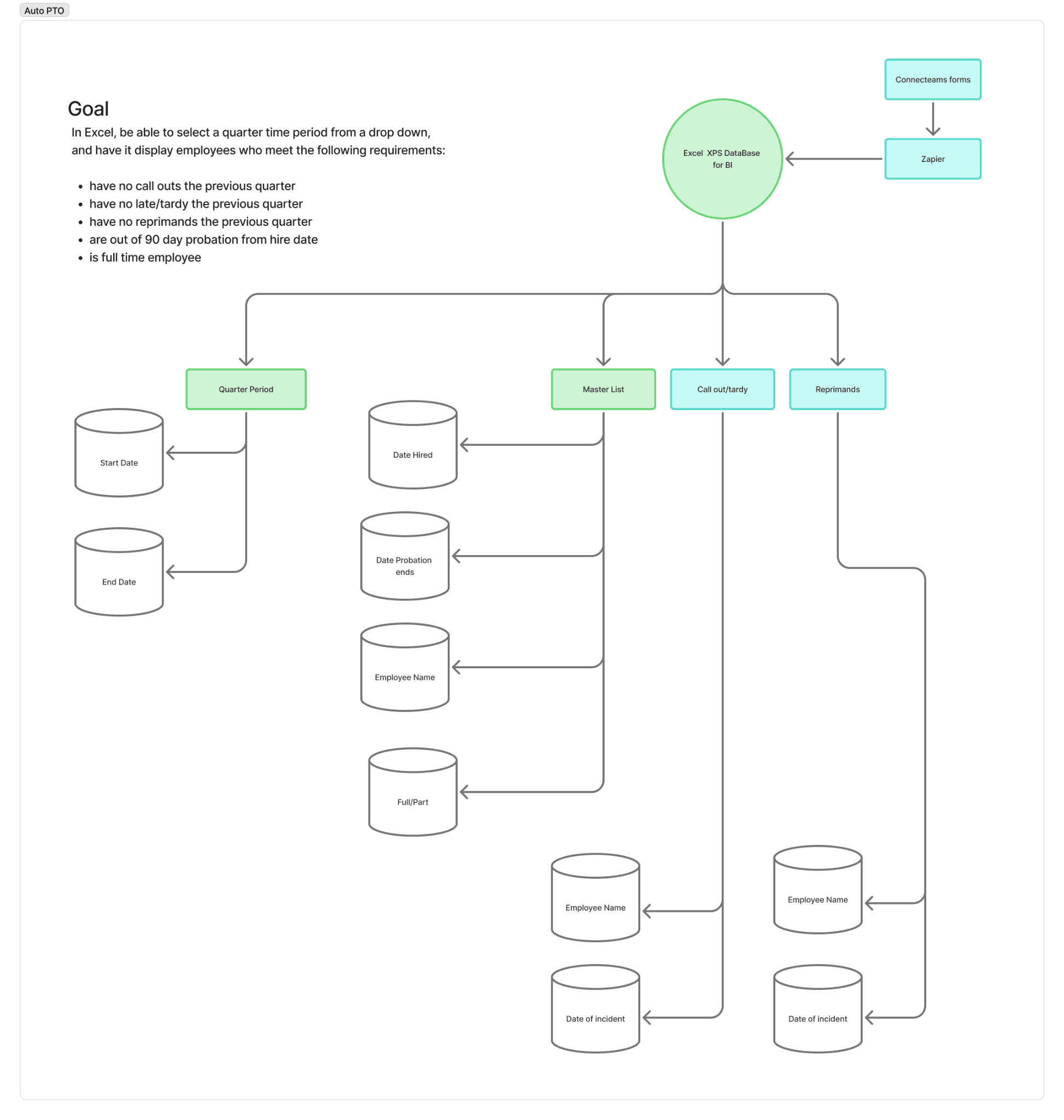
Before building the dashboard, I mapped the attendance and PTO logic across employee status, review periods, attendance records, reprimands, and probation rules so the system could apply the policy consistently.

I also worked through how employee, schedule, time-clock, and access-control records would map together before they were shown in the dashboard.
03 Decisions
What the data could actually tell us.
The dashboard was pulling together schedules, clock activity, building access, and attendance rules, but those sources did not all mean the same thing. I needed to make the useful patterns visible without turning incomplete data into conclusions the system could not support.
Decision 01
Use the right evidence for the right employee.
Hourly employees could be compared against scheduled shifts and clock activity. Salaried office employees needed a different view, where building access could help show arrival patterns without pretending it proved an entire workday.
Tradeoff 01
Leadership has two attendance views to learn instead of one universal rule.
Decision 02
Apply the rules consistently without hiding uncertainty.
I automated the rules the system could reasonably determine, including the five-minute grace period and late classifications. When the data was incomplete, I kept that visible instead of turning a missing record into an assumption about attendance or work location.
Tradeoff 02
The dashboard shows more "incomplete data" states than a system that guessed. Less tidy, but every classification is defensible.
Decision 03
Support the PTO decision, not make it.
The dashboard flags who meets the PTO eligibility rules and shows the evidence behind each flag, but approval stays with management. Attendance data can be incomplete, and a personnel decision shouldn't rest on a record nobody checked.
Tradeoff 03
Management still spends time on the final PTO review, in exchange for keeping personnel decisions with a person.
04 DELIVERY
From scattered data to a working dashboard.
Connecteam supplied employee, schedule, and clock data. Building-access events needed their own synchronization process. Google Sheets became the operational and audit layer, and Apps Script handled API requests, transformation logic, classifications, triggers, and the application backend.
I organized the dashboard around the three questions leadership actually asks: what happened, does it look like a pattern or an exception, and does someone need to review it? That became four focused views instead of another dense reporting tool.

The Overview keeps the leadership view focused on exceptions, with quick counts for late arrivals, missed shifts, missing clock-ins, and missing clock-outs.

Late clock-in patterns are separated from individual attendance events so leadership can see repeated behavior over time instead of reviewing isolated incidents one by one.

PTO eligibility view showing the review quarter, attendance criteria, eligibility results, and quarterly PTO award calendar.
05 IMPACT
A manual review across three systems became one repeatable workflow.
Attendance review used to take at least two hours a week of switching between Connecteam, access records, and the attendance policy, then interpreting what each record meant. Now it takes about 12 minutes. The dashboard combines Connecteam data with office-access events, checks them against shared attendance rules, and refreshes about every 15 minutes, so leadership no longer rebuilds the picture by hand.
It also created a reviewable record. Attendance classifications, late patterns, office-arrival evidence, and PTO screening all come from the same rules, so two people reviewing the same week start from the same place.

What had been a manual review across schedules, clock records, and access data became one repeatable management workflow with the supporting evidence visible in the same place.
06 REFLECTION
The hardest part was deciding what the data was allowed to say.
Connecting the systems was the technical part of this project, but the product problem was interpretation. Operational data often looks more definitive than it is. A door entry shows that a credential was used at a certain time, not what the employee did that day. A missing clock record shows that information is missing, not why.
That distinction shaped every screen. I automated the parts of attendance review that could be made consistent and kept uncertainty, evidence, and management judgment visible where they still mattered. This is the internal systems work I enjoy most, because the interface is only part of it. The rest is building a process people can trust.

