B2B SAAS · PRODUCT MODERNIZATION
DRAC Mobile
Client
Dan’s Recycling and Autocore
Role
Lead UX/UI Designer
Timeline
2023–2024
Platform
Subscription B2B Mobile Platform · iOS + Android

70%
Fewer usability complaints
Client-reported
90%
Positive post-launch feedback
Client-reported
1,800+
Monthly users on the live app
Published by DRAC
My role
Lead designer on the redesign of a live app with paying users. I decided what to change and what to leave alone, working with the PM, lead engineer, and client.
Team
Project Manager · Lead Engineer · Engineers · Client Stakeholders
Scope
Product Audit · Workflow & IA · Interaction & Visual Design · Design System & Accessibility · Design QA
Tools
Figma · Jira · Confluence
01 Context
The app had grown far beyond the interface it started with.
DRAC began as a fast way for catalytic-converter buyers to look up pricing in the field. Over time, it expanded to support purchase orders, customer management, compliance documentation, inventory, calculators, and a large converter database. Each new capability solved a real business need, but the overall product structure had not evolved at the same pace. Related tasks became separated, navigation reflected where features had been added, and common purchasing workflows increasingly required users to move between different parts of the app.
Two things made the redesign necessary. Subscribers were leaving, and a new compliance rule had to be built into the product. Fixing the friction and handling the new rule had to happen in the same redesign.
I was redesigning a product people already depended on, with established customers and years of domain knowledge built into it. About 1,800 people used the app every month, so every change I made landed on active customers.

DRAC’s original mobile experience centered on converter search and pricing, with dense result cards and limited hierarchy between search, product information, and actions.

Individual converter records carried the pricing and identification information buyers relied on, but the interface had grown around features rather than a consistent mobile system.
02 Discovery
I audited the whole product before deciding what deserved to change.
My first instinct was to observe buyers in the field, but several buyers were not comfortable having a designer accompany them during purchasing trips.
The project manager and senior engineer observed those workflows and brought their findings back to the team. At the same time, I completed a full product audit. I documented every screen, mapped navigation, traced workflows across search, pricing, purchasing, customer management, account features, and compliance, and worked with the lead developer to understand why different parts of the product behaved the way they did.
Discovery 01
The purchasing workflow was spread across the product.
A buyer might think of the work as one transaction, but the product separated search, pricing, customer information, payment, documentation, compliance, and other requirements into different parts of the app. That created extra navigation during work that was already closely connected.
Discovery 02
The app had accumulated too many one-off patterns.
Controls, forms, overlays, navigation, layouts, spacing, and repeated actions had evolved at different times. Similar interactions could look or behave differently depending on where someone was in the product.
Discovery 03
Familiar did not always mean broken.
Some older patterns looked inconsistent but were already well understood by experienced buyers. Changing them just to make the interface cleaner could slow people down without solving anything meaningful. The audit helped me separate the things that were genuinely getting in the way from the things users had already learned and relied on.

I audited the existing mobile product screen by screen to identify repeated interaction problems, inconsistent patterns, and areas where the product had outgrown its original structure.

The audit showed that even core workflows like converter search had accumulated several competing patterns, unclear actions, and layout inconsistencies within a single screen.
03 Decisions
Reorganize the product around the transaction.
Once I understood how the product had grown, I could be much more selective about what I changed. I focused on reconnecting the parts of the product that belonged to the same purchasing workflow and standardizing patterns where inconsistency was creating real friction.
Decision 01
Keep familiar patterns when they still worked.
I did not replace an interaction simply because it looked old or behaved differently from another part of the app. If experienced buyers understood it and changing it did not create a clear benefit, I left it alone. That kept the redesign from becoming a relearning exercise for existing customers.
Tradeoff 01
Some visual inconsistency stayed in the product on purpose. Experienced buyers already knew those patterns. Cleaning them up would have cost them speed and given nothing back.
Decision 02
Bring the purchasing workflow back together.
I mapped how search, pricing, customer information, purchasing, payment, documentation, and downstream requirements connected across a transaction. That view helped me reduce unnecessary jumps between features and keep related information closer together. Search also became a stronger entry point because buyers frequently started by identifying a converter and needed a direct path into the information connected to it.
Tradeoff 02
Restructuring navigation meant some features moved, even for users who knew the old layout. Buyers were jumping between disconnected sections to finish a single transaction, and a one-time adjustment beat that friction on every purchase.
Decision 03
Build compliance into the transaction.
Compliance had become its own destination in the app even though much of the required information was already part of the purchase. I recommended integrating common federal requirements directly into the purchasing workflow while still allowing state-specific requirements when necessary. Documentation and validation became part of completing the transaction instead of something buyers had to remember to finish somewhere else.
Tradeoff 03
Federal requirements added required steps to every purchase, with state-specific rules handled as exceptions. The new compliance rule applied to every purchase, so building it into the flow meant buyers met it as part of the transaction instead of leaving it for later and forgetting.
04 Delivery
Carry the new structure through the rest of the product.
The PM brought customer feedback and field observations. Engineering brought technical constraints and years of product knowledge. The client brought business priorities and made the final calls. My job was to turn those inputs into one product.
Once the workflow structure held, I worked through the interface layer: navigation, hierarchy, forms, overlays, controls, states, and reusable components. I checked color contrast against WCAG AA as the visual system came together, including on the dense converter and pricing screens buyers read in the field. Those screens stayed dense because buyers need that information. Purchasing flows got easier to follow. Account and subscription features started behaving predictably.
I stayed with the build through specs, edge cases, and design QA. I worked with the lead engineer on compliance rules and purchase-order states so the patterns held up once they were built.

The redesigned search experience brought search, filtering, recent activity, result views, and purchase actions into a more consistent mobile workflow.

The purchase-order workflow was carried through detailed states for search, editing, compliance, customer information, payments, and supporting documentation before development handoff.
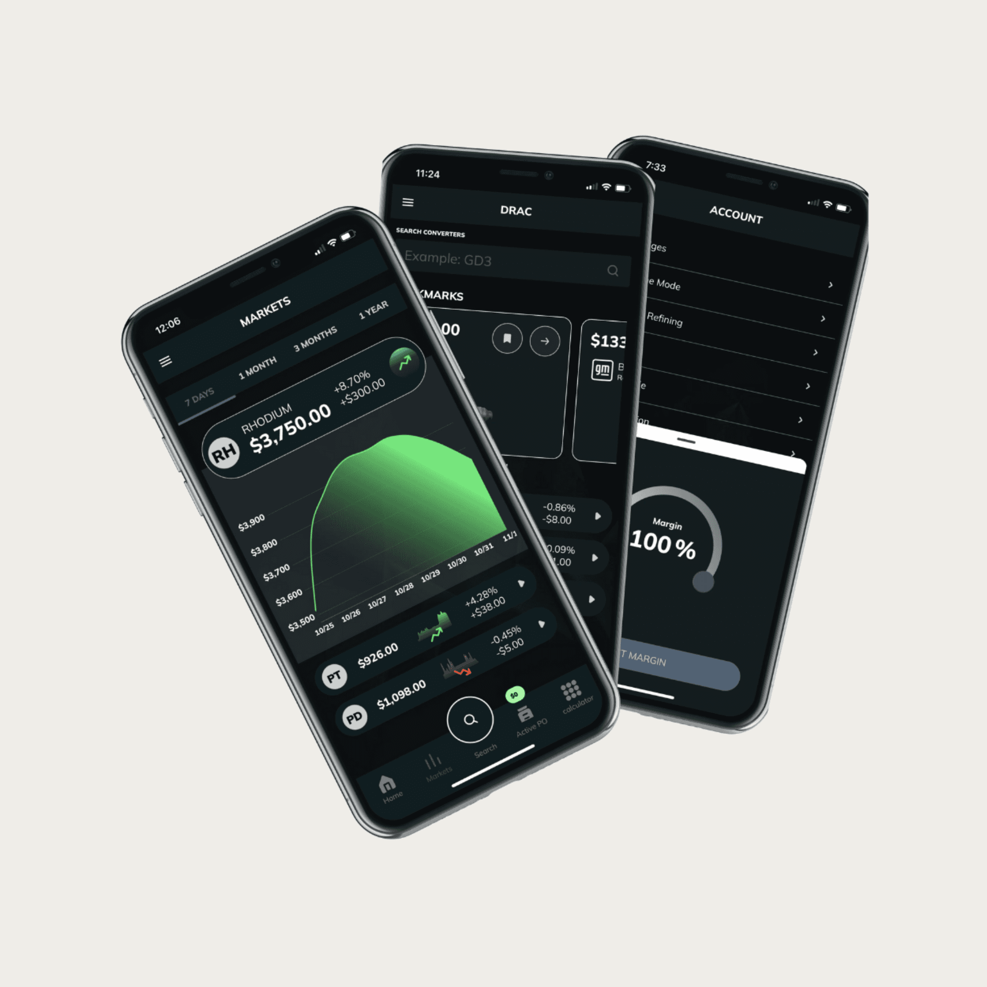
The final visual system was applied across search, market data, account tools, and other core mobile workflows while keeping dense operational information easy to scan.
05 Impact
The product became more connected without asking customers to relearn it.
The client and project team reported a 70% drop in usability complaints and 90% positive feedback after launch.
Subscriber loss was one of the reasons for the redesign. I don't have retention numbers from after launch, so I can't say how much the redesign changed it. What I can point to is the drop in usability complaints and the strong post-launch feedback.
For scale, the platform has 21,000+ registered users and 19,000+ mobile downloads in the tracked period, and it has processed over one million pounds of PGM material. Those numbers describe DRAC as a business, not my design outcomes.
The app is live on Google Play.

The redesigned converter search kept the same core task familiar while making results easier to scan, actions clearer, and navigation more consistent across the mobile experience.
06 REFLECTION
The hardest part was knowing what not to redesign.
DRAC changed how I think about mature products. When a product has years of customers, habits, business rules, technical decisions, and domain knowledge behind it, some of the mess has a reason for being there.
The audit helped me understand that history before I started replacing things. I became much more careful about separating inconsistency from actual friction. If something made information harder to find, added unnecessary navigation, or interrupted the purchasing workflow, I had a reason to change it. If people already understood it and changing it offered very little benefit, I left it alone. That approach has stayed with me. I want to know why something works the way it does before I decide it needs to be redesigned.

